User experience is at the heart of good web design. Although visual aesthetics matter, the success of a website hinges on usability and utility. Your website visitor is the one who will be using your website, so every web design decision must be from their perspective.
Here at Magenta Design, we believe in user-centric web design. And that’s the only way to ensure maximum ROI for your business. In this post, we talk about important principles that can result in an effective website design that converts visitors into customers.
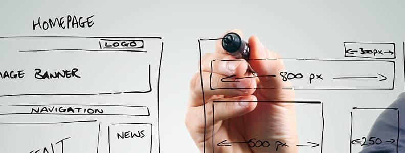
Make it Easy for Your Users
The very first rule of usability is that each page on your website should be clear and self-explanatory. If the site architecture and navigation are not intuitive and simple, visitors will be forced to think, and that’s the last thing they want to do.
If your website is hard to understand and navigate, things won’t go smoothly. Make sure the menu design is simple and the site architecture makes moving through your website effortless.
Don’t Test Visitors’ Patience
If you are going to ask your visitors to fill out a form, keep it short and succinct. Whether it is a lead magnet form, a contact form or a check out form, ask for only the most crucial information.
Filling lengthy forms can put off your visitors, and they may leave your website, never to return.
If you are offering a tool or service, let them test it without requiring them to submit personal information such as email address. If they are happy with the tool, they are likely to take the next step. So, ask for an email address after they’ve tried your free tool.
Direct Visitors’ Attention to Your Primary Message
Some parts of your website may attract more attention compared to others. For instance, graphics and images are likely to grab eyeballs compared to plain text. Similarly, bold text is bound to attract more attention than plain text.
Given that the human eye is an extremely non-linear tool, online users can recognise motions, patterns and edges instantaneously.
Directing user’s attention to a specific part of your website with subtle use of visual elements can ensure your visitors get from one point to another intuitively. The less they have to think, the better experience they will have and the more likely are they trust your brand.
Use White Space to Your Advantage
White space, also known as ‘negative space’ is the part of a website that is empty. It is the ‘blank’ space between margins, graphics, text, columns or even visuals.
It isn’t just empty space; it’s a crucial part of web design. It is as important as the elements that exist within it. Effective use of white space enables the hierarchy of information, images, colour or event typography.
White space not only ensures that visitors are not overloaded with information but it ensures that they can clearly understand your message.
A page with insufficient white space will look cluttered and busy. Generally speaking, it will be hard to scan, read, assess and work with. In fact, your visitors may not even bother. They will simply leave your website.
Good use of white space gives your website a clean look. Although clean design helps communicate your message, it in no way means less content.
A clean design ensures the available space is being used efficiently.
Keep it Simple
This should be the key objective of website design. People rarely visit a website to admire the visual aesthetics. In fact, more often than not, they are searching for information even when the design isn’t on point. Strive to keep things simple instead of complex.
From the user’s perspective, the best type of web page is one that has clean text, sans any ads or visual impediments, and provides the information/content that the user is searching for.
Write for Online Audience
When writing for your website, it’s important to adapt the writing style to the browsing habits and preferences of online users. Avoid promotional content; it will go unread. Long walls of text without any visual elements or keywords marked in italics or bold are likely to be skipped.
Stay on point. Avoid clever or cute words, jargon, marketing phrases or any unfamiliar technical words. The best type of copy is one that does not beat around the bush and gets to the point without wasting time or words.
Here are some tips to write effective copy:
- Keep sentences and paragraphs short.
- Use simple, objective language.
- Break down your content into digestible chunks. Make use of sub headings and bullet lists.
Magenta Design Can Help!
Our web design team will take the time to understand your business, goals and target audience to create an effective website for your business. Whether you want to sell online, take bookings or generate leads, we know what it takes to build a website that delivers the results you seek. Talk to us today to discuss your website design project.


